6.1 Two-Dimensional Plotting Functions in MATLAB6.1.1 Using fplot
6.1.2 Annotating fplot
6.1.3 Making a bar graph
6.1.4 Making a pie chart
6.1.5 Using plot and yxplotLine types and colors for plotting functions6.2 Miscellaneous Grpahics Commands
6.3 Three-Dimensional Plotting Functions
6.4 Advanced Features of Plotting6.4.1 Using Plot Handles
6.4.2 Printing and Saving Graphics Files
6.4.3 Images and Graphs
Every student in science or engineering will find many problems that
have solutions that are best presented in graphical form. There are
many ways to use computer systems to help construct various types of
plots. One advantage of using a computer to do so is the fact that
much experimental data is now analyzed on computers and therefore
this data is directly available in stored form for feeding to a
graphics package.
6.1 Two-Dimensional Plotting Functions
in MATLAB
6.1.1 Using fplot
The new version of the function plotting program: fplot has a number of options that will allow you to construct a variety of two dimensional plots. Here are first notes about the function given in the help comments:
>> help fplot
FPLOT Plot a function.
FPLOT(FNAME,LIMS) plots the function specified by the string variable
FNAME between the x-axis limits specified by LIMS = [XMIN
XMAX]. LIMS = [XMIN XMAX YMIN YMAX] gives optional y-axis
plotting limits.
Further down in the help notes we find one way to specify the function that will be plotted that is most useful:
FNAME may be an eval-able string with variable x, such as 'sin(x)', 'diric(x,10)' or '[sin(x),cos(x)]'
This means that we form a string that specifies any legal Matlab command. It might be as simple as 'sim(x)' or involve more complicted expressions such as: 'exp(-2*x).*sin(x) -5cos(x)'. Let's see what one example given near the end of the help notes gives:
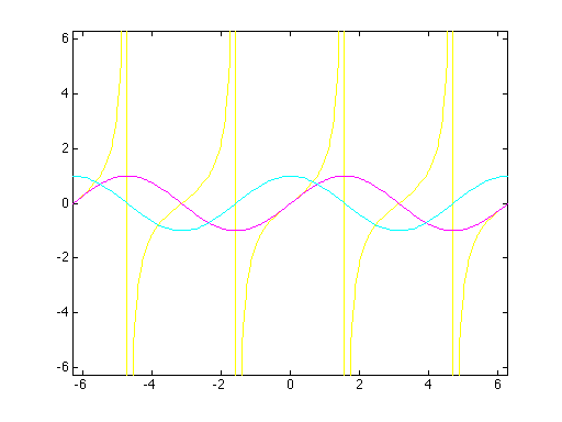
>> fplot('[tan(x),sin(x),cos(x)]',[-2*pi 2*pi -2*pi 2*pi])
Our example gave the names of the functions to be plotted: tan(x), sin(x) and cos(x) in that order. Note that:
The second argument given the plot function said to plot these function for a range of x from negative two Pi to positive two Pi. It also said to limit y to the same range. Without this specification about the range for y, we would have had a plot that just showed a very large jump in tan(x) at each of its discontinuities and the other functions would have looked like straight lines.
6.1.2 Annotating fplot
The plot constructed so far is very barren of information. It may be quite useful for a few minutes, but it would not be acceptable as the solution to an assignment or in a report. In order to be used as a solution, we need to include at least a title and put labels on the axes. It may also be very helpful to include information that tells which curve on the plot goes with each function and to add a grid that makes it easier to locate points. The commands: xlabel and ylabel allwo you to add albels to the axes. A title for the plot may be placed using the command: title. The command legend will allow you to automatically differentiate multiple curves. All of these commands are simple enough that an example of their use should show you the basic dieas behind them. If you need more information about the way they are used, try help with them. Here are examples of each applied after the plot of the trigonometric functions was created. The first command set is used to change the font used so that text on the axes and in the title are readable.
>> set(gca,'FontName','Helvetica','Fontsize',12)

>> xlabel('x')

>> ylabel('f(x)')

>> title('Trigonometric Functions')

>> legend('tan(x)','sin(x)','cos(x)')

>> grid
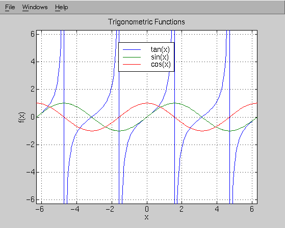
Note that the legend command uses color to designate the lines in the order they were drawn. This works fine as long as they are viiewed on a color screen, but this can all be lost if you print to a black and white printer. In such a case, it would be advisable to use lines that have different symbols on them. That is one of the options of fplot that will be useful.
Two types of graphs are used extensively in presentations: bar graphs and pie charts. Both may be easily used in Matlab. The help command applied to each will tell you most of what you need to know, but here is an example of the use of each.
|
Compound/Stream |
Stream 1 |
Stream 2 |
Stream 3 |
|---|---|---|---|
|
|
1.985 |
|
|
|
|
0.020 |
|
|
|
|
0 |
|
|
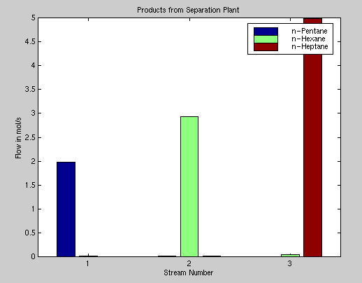
6.1.3 Creating a bar Graph
First here is a session used to create a bar graph:
>> ns=[1.985 .015 0;.02 2.93 .05; 0 .015 4.985]'

ns =

    1.9850    0.0200         0

    0.0150    2.9300    0.0150

         0    0.0500    4.9850

>> bar(1:3,ns)

>> legend('n-Pentane','n-Hexane','n-Heptane')

>> xlabel('Stream Number')

>> title('Products from Separation Plant')

>> ylabel('Flow in mol/s')
Here is the figure produced by this sequence of commands:
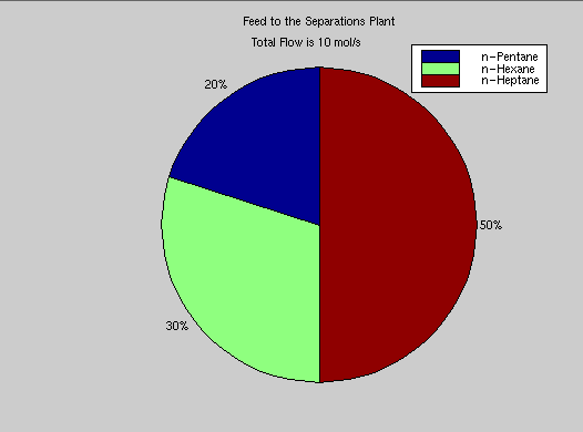
6.1.4 Creating a pie Chart
Here is a session used to produce a pie chart giving the mol fractions of each compound in the feed to the plant.
>> sum(ns)<-- This sums over columns of ns to give the total in each stream

ans =

    2.0050    2.9600    5.0350

>> sum(ns') <-- This sums over rows to give the total flow of each compound

ans =

     2     3     5

>> pie(sum(ns'))<-- to produce a pie chart of the feed flows

>> title('Feed to the Separations Plant')

>> gtext('Total Flow is 10 mol/s')
Note that the legend from the provious bar figure is still while we do this. Here is the figure:
6.1.5 Using plot and yxplot
The plot command may be used to plot sets of points that might represent experimantal data or could be from functions. Here is the beginning of the notes form help applied to the command:
>> help plot
PLOT Plot vectors or matrices.
PLOT(X,Y) plots vector X versus vector Y. If X or Y is a matrix, then the vector is plotted versus the rows or columns of the matrix, whichever line up.
An important note about line types and colors is given in the help for plotting functions:
Various line types, plot symbols and colors
may be obtained with
PLOT(X,Y,S) where S is a character string made
from any or all the following 3 colunms:
           y     yellow        .     point              -     solid

           m     magenta       o     circle             :     dotted

           c     cyan          x     x-mark             -.    dashdot

           r     red           +     plus               --    dashed

           g     green         *     star

           b     blue          s     square

           w     white         d     diamond

           k     black         v     triangle (down)

                               ^     triangle (up)

                               <     triangle (left)

                               >     triangle (right)

                               p     pentagram

                               h     hexagram


For example, PLOT(X,Y,'c+:') plots a cyan dotted line with a plus

    at each data point; PLOT(X,Y,'bd') plots blue diamond at each data

    point but does not draw any line.
Note that this same option to change line type or color applies in the use of fplot.
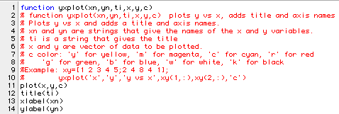
The plot command may be used in a variety of ways, but just like fplot, it produces plots that are poorly annotated. This is partly alleviated in the program yxplot. The program is stored in ~ceng301/matlab/ceng303. It allows one to plot any one set of y data vs a set of the same length of x data points and adds a title and axis names. A listing of yxplot is given below:
An example of using the function is shown in the following session:
>> t=0:.5:7;       <-- A vector of times: 0, .5, 1.0, ..7.0


>> d=[0 1 1.6 2 2.1 1.9 1.6 1.3 1.1 1 .9 .95 1 1.05 1.03]; <-- Distances


>> yxplot('time','distance','Lab Experiment 1',t,d,'c')


>> grid
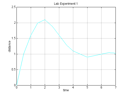
The color you choose for the curve can be particularly important when you want to print your graph or when you want to insert it in notes such as this. The default color is yellow. Yellow shows up well against a black background but it is not suitable with light backgrounds such as white. The print command places the graph in a rectangle centered in the middle of the page. The orient command can be used to change the way a page is oriented when printed.
>> help orient


 ORIENT Hardcopy paper orientation.

 ORIENT LANDSCAPE causes subsequent PRINT operations

 from the current figure window to generate output in

 full-page landscape orientation on the paper.

 ORIENT PORTRAIT returns to the default PORTRAIT

 orientation with the figure window occupying a rectangle

 with aspect ratio 4/3 in the middle of the page.

 ORIENT TALL causes the figure window to map to the

 whole page in portrait orientation.

 ORIENT, by itself, returns a string containing

 the current paper orientation, either PORTRAIT or

 LANDSCAPE (but not TALL). ORIENT is an M-file that sets

 the Paper Orientation and Paper Position properties of

 the current figure window.


    See also PRINT.